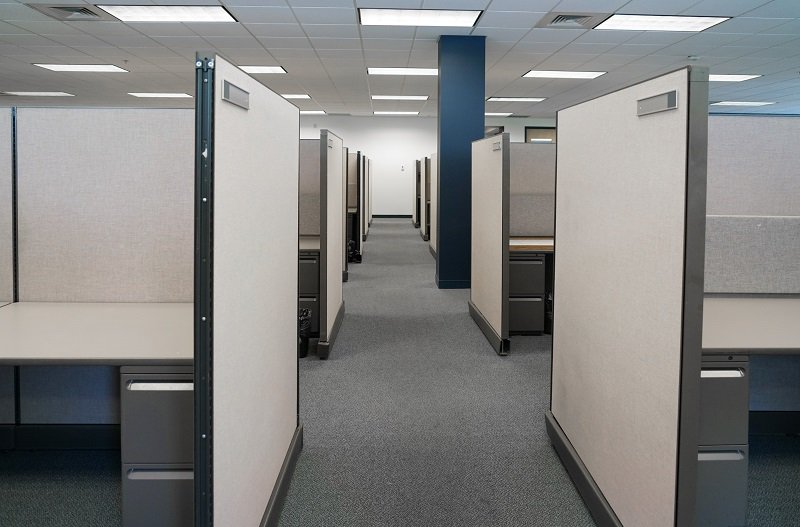
The office cubicle is arguably the most loathed of all office layouts. It conjures up images of dread, drudgery, and David Brent-esque bosses.
Such preconceptions are accurate, as research reveals cubicles tend to reduce employee morale and productivity. Another study found they cause conflict, high blood pressure and increased staff turnover.
But it wasn’t always meant to be this way. The cubicle was originally intended to free office workers with its revolutionary design.
The tale of the cubicle starts in the 1950s with German design group Quickborner. Its Bürolandschaft – or “office landscape” – introduced the idea of more organic groupings of desks fitted with partitions for privacy.
Then, in 1964, American furniture company Herman Miller took things one step further and came up with an office design to empower workers. Its first iteration was “The Action Office.”
Cubicle 1.0 – The Action Office
The Action Office was the brainchild of designer Robert Propst, who was under the supervision of George Nelson, one of the founders of the American Modernism movement. Nelson was the director of design at Herman Miller at the time and the first Action Office line was designed in his studio, earning Nelson the prestigious Alcoa industry award.
However, support for the colorful and customizable Action Office line fell flat as it failed to win the hearts and minds of America’s executives. They wanted a space that was easily reproducible to keep pace with rapid demand for more office space. What’s more, the concept of a customizable workspace didn’t sit well with executives, many of whom failed to consider the individuality of their employees.
Nelson subsequently stepped back from the project, but Propst continued to develop the concept. In 1967, the “The Action Office II” was born.
Propst’s revamped workspace design featured height adjustable walls, which were originally meant to form a 120-degree angle. As a result, workers could gain some privacy but also be available to colleagues as and when they were needed. The workstations also had room for a standing and sitting desk, pushpin walls for easy personalization of the space and several stacks of shelves.
When the Action Office II was unveiled, it was met with public acclaim. The New York Post claimed “Revolution Hits the Office.”
Such a positive response is understandable. At the time, most office designs wanted to keep workers in one place. The Action Office II took the opposite approach and encouraged workers to move, interact and collaborate, an approach that should sound familiar to anyone familiar with the Google campus or coworking. The cubicle’s easy-to-assemble and lightweight design also ticked all the boxes for executives.
Nelson quickly distanced himself from the Action Office design. In 1970, he wrote the following to Herman Miller’s VP of corporate design and communication: “One does not have to be an especially perceptive critic to realize that Action Office II is definitely not a system which produces an environment gratifying for people in general. But it is admirable for planners looking for ways of cramming in a maximum number of bodies, for ’employees’ (as against individuals), for ‘personnel,’ corporate zombies, the walking dead, the silent majority. A large market.”
The Action Office II: Propst’s intentions, misinterpreted
Things started to go wrong for the Action Office II when companies realized they could fit in more employees per square meter by taking Propst’s 120-degree walls and putting them at a 90-degree angle instead.
Propst’s originally spacious design was transformed into a space-saving tool for businesses. As competitors began to copy the design, the close and cramped boxes we are now all too familiar with began to infiltrate our offices.
The resulting cubicle farms were completely at odds from Propst’s original intention. In 1978, he began sending memos to undo the “easily defined and accountable cost savings” that were taking over the autonomy he wanted to introduce to the world’s offices. “Meanwhile, other matters of more profound influence on the real productivity of organizations have slipped into the background,” he worried.
Unfortunately, for the 60% of American office workers who find themselves in cubicles, Propst’s efforts were too little, too late.
In 1997, Propst told The New York Times that he had designed the Action Office II to “give knowledge workers a more flexible, fluid environment than the rat-maze boxes of offices.” However, he denounced what his creation had become: “The cubicle-izing of people in modern corporations is monolithic insanity.”
“Not all organizations are intelligent and progressive,” he lamented. “Lots are run by crass people. They make little, bitty cubicles and stuff people in them. Barren, rathole places.”
Is the cubicle ready to make a comeback?
Today, companies realize offices need to achieve a balance between privacy and autonomy. Ironically, this was Propst’s original intention with the Action Office design.
What’s more, noisy open plan designs have come under fire for reducing productivity, which was led some to question whether the cubicle could be set for a comeback.
The Action Office concept that was intended to free workers by providing them with a customizable space was completely warped by executives hungry for maximizing the use of floor space. It would be quite fitting if the humble cubicle was resurrected for the modern workplace by incorporating its original values into a revamped design.
As one report succinctly points out: “Cubicles aren’t required to be stuffy or boxy to be effective. Cubicle design can be both fun and functional, and fit in your design without sacrificing comfort in a modern office.”
Is third time a charm for the office cubicle?


